One day I decide to walk down from Penn Station, where I get off the train, to my office at Union Square, determined to soak in all the text that I can see on the streets. The distance I need to cover is about twenty blocks, and I quickly realize that I will not be able to keep up the standard New York walking pace if I am serious about doing this; there is just way too much text to take notice of. First, I have to cut through Koreatown on 32nd street, a particularly dense section of the city that is bewildering when it comes to the pervasiveness of written signs. I start to heavily filter out the onslaught of textual information, as the majority of the signs are printed in a Korean calligraphy that I find aesthetically intriguing but impossible to understand. I focus instead on the many bilingual signs that give away the mishmash of activities taking place in the area: special offers for eyelash extensions, unlocking cell phones, countless ads for hair and nail salons, acupuncture and holistic healing treatments, karaoke bars with parlors that can be rented for private parties, and the menus of Korean grill houses and mandoo joints where photos of the dishes help to decipher the Korean text. I am not fooled by fancy French names like Tous Les Jours that mimic French patisseries but are truly Korean establishments serving an almost exclusively Korean clientele. As a seasoned urban explorer I also search for more ephemeral and informal signs on lamp posts and electric junction boxes to find offers for English lessons and stickers with enigmatic tags while walking by the typical handwritten cardboard sign of a homeless woman curled up on the sidewalk asking passers-by for change.
As I turn south on Fifth Avenue, there is a temporary relief from the cornucopia of signs and makeshift advertisements for exotic ethnic businesses. The character of signage changes dramatically: it becomes larger, sparser, and more professional. The simple white-green color scheme of New York street name signs and the signature typographic design of the subway entrances dominate this section of my journey. But as I look over onto Broadway I also see the fading prints of old, by now defunct companies painted on the vast brick facades of warehouses that used to be part of the garment district but today mark a nondescript area that functions as a hub for an informal market in cheap jewelry, knockoffs, and fake designer items. Turning on Broadway at 23 rd street, I notice that the gigantic mural-like advertisements for recent blockbuster movies or national chains like JC Penney, which used to be hand painted with amazing precision by so-called “walldogs”, a peculiarly New York occupation, are now being increasingly replaced by large format, digitally screen-printed, mass produced billboard advertisements.
I am mentally exhausted and saturated with the myriad of messages that I strive to record and internalize by the time I reach my final destination on Union Square. This dizzy state reminds me of the pertinent observation made by the ingenious German sociologist, Georg Simmel exactly 110 years ago in his famous essay on the Metropolis and Mental Life. He suggested that the ability to develop a blasé attitude – i.e., to screen out and ignore the overflow of impulses that are produced by an intense urban environment – becomes an indispensable survival skill in a large city. And indeed, on a routine day I only notice a fraction of the “text messages” I am bombarded with in the city: either the ones that stand out due to their originality or surprise effect, or those that I find reassuring by virtue of their everyday familiarity. This is, of course, a commonplace fact to all those, such as advertisers or graffiti writers, whose expertise lies in the strategic placing of signs and texts in the urban environment.
In every city we are confronted with some mixture of commercial, political, and personal messages as we go about our daily business. Nevertheless, the particular combination of genres in specific neighborhoods, the relative weight of the commercial to the political and personal, the style and typography, the centrality and visibility, or the types of surfaces and urban structures that carry the text are always emblematic of individual cities.
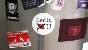
In Berlin, for instance, political texts of all sorts, including old-fashioned anti-capitalist slogans, expressions of solidarity with anti-government demonstrators in far-away Istanbul, or simple stickers that try to deter tourists from particular neighborhoods (e.g., the “Berlin doesn’t like U” campaign in Kreuzberg) are still more ubiquitous and visible than in other cities. Similarly, there are entire genres of signage that remain prevalent in Berlin that have nearly vanished from other cities. Among these, the most typically Berlin-style writings on the wall are the ones that are painted in huge, monochrome, square-shaped letters in the uppermost section of expansive, empty facades, ensuring supreme visibility from great distances. As I regularly walked by one on Schönhauser Allee that read: “Diese Stadt ist aufgekauft” (this city is bought out), I always wondered how the text was actually applied to the wall. I was finally let in on the secret after watching a recent documentary, “Berlin spricht Wände”, produced by the East Cross Projects, namely by Markus Muthig (aka Emus Primus). Here it is revealed how the text is painted with rake-like brushes and real paint (white or black) letter by letter and upside down from the roof of the building.


![“Sponti-graffiti” spotted from the train on the way to the Wedding S-Bahn station. It says “Tanz den Untergang mit mir” (Dance [into] the downfall with me) © Virag Molnar](https://publicseminar.org/wp-content/uploads/2013/11/tanz_den_untergang-300x216.jpg)
The origins of Sponti-slogans can be traced back to the various student movements of the 1960s and the consequent rise of the Sponti-movement throughout the 1970s and 80s which tried to break with traditional forms of (Marxist) protest advocating spontaneous, ironic, site-specific urban interventions instead. Many Sponti-sayings were originally coined by provocatively and humorously altering well-known proverbs and expressions resulting in slogans like “Liberté, Egalité, Pfefferminztee” or “Auf deutschem Boden darf nie wieder ein Joint ausgehen” (“No joint should ever be put out again on German soil”) which was a malapropism for the widely used political slogan “Von deutschem Boden darf nie wieder ein Krieg ausgehen” (“No war should start again on German soil”). Sponti-sayings were disseminated not merely through mainstream media but also through the subversive medium of graffiti spread over the walls of buildings or even public toilets. Graffiti was indeed seen as an important tool to reclaim the city by “overwriting” its dominant text.
The Spontis had a lot in common with other contemporary avant-garde formations, most importantly with the Situationist International (SI) that was founded in 1957 and had close intellectual ties to French surrealism. Urban space was central to the social transformative aspirations of SI while urban interventions were integral to its tactical repertoire, in part owing to the influence of the work and personality of Henri Lefebvre, the most important figure of postwar French urban theory. Artists associated with SI were to “create situations” that critically transformed everyday life through constructing unexpected encounters by using strategies like dérive (drift) and détournement (diversion, semantic shift) and by upholding urban play as a free and creative activity. Examples for transformative situations included equipping street lamps with switches so that people can adjust the lightening as they wish, abolishing museums and distributing their masterpieces to Parisian bars, turning prisons into tourist destinations, and holding a monthly lottery in which a visitor could win a real prison sentence, or removing all information about departures (destinations, timetables) at train stations to facilitate dérive.
In fact, the Spontis and like-minded groups such as the West-Berlin-based Spassguerilla, which most closely followed in the spirit of SI in employing humor and irony as means of social critique, were often accused of being too frivolous and unserious by the more traditional protest movements. The explicit political content of Sponti graffiti has waned even further over the decades following the turbulent sixties, parallel with how it has become an established genre of urban popular culture.
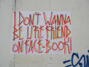
At the same time, from the turn of the millennium there has been a sudden renaissance in urban interventionism, often referred to by the broad umbrella terms of street art or urban art. These labels are used to denote a very heterogeneous mix of practitioners, genres, techniques and more elaborate artistic agendas (or lack thereof). They include a wide range of subversive art practices and reinterpreted techniques from post-graffiti stencil art, wheatpasting, sticker art, redesign of street signs, guerilla knitting, flash mobs, street installations, culture jamming, subvertising to site-specific theater which all typically involve the surprising and interactive reframing of public spaces. And even though many of the active practitioners in this diffuse field of cultural production feel deeply ambivalent about the labels of “street art” and “urban art” that are indiscriminately attached to them, they all seem to be united in their effort to engage critically with cities and the spatialities of everyday urban experience. They tend to be less concerned with rallying around specific political issues than with intervening in urban spaces so as to question, refashion and contest prevailing norms and ideologies such as commercialization or gentrification, and to create new meanings, experiences, relationships and situations. (See Website of street artist, sp38)
The work of BRONCO in Berlin offers a distinctive example of this new brand of urban interventionism: one that also helps to revisit the power of text in urban communication in a time when interventionist practices are dominated first and foremost by the use of strong visual imagery or diverse modes of performance. And indeed, I came across BRONCO not by chance but because I was in search of forms of interventions in Berlin that used text as their primary raw material. I became interested in this genre after having discovered the work of the “Two-Tailed Dog Party” (Kétfarkú kutya p árt), which is the alter ego of a Hungarian urban artist and public provocateur active in the streets of Budapest. The Two-Tailed Dog Party turned to the most common tropes of everyday urban communication, including public notices, informal classified ads for small businesses, missing dog and cat signs and subverted them with the simple power of rewording to caricature the anomie, absurdity, and farce of contemporary Hungarian society and politics.
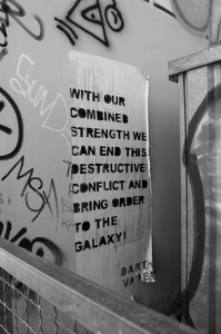
While BRONCO’s work is less intentionally political, it still attests to the intense and inventive use of text and language in European strands of urban interventionism. For instance, “Kapitulismus: Streetart is the gel in the hairdo of capitulism” can be seen as an homage to classic Sponti-sayings, showing how the spirit of Sponti lives on inspiring new forms of linguistic creativity and how it resonates with recent developments in the contemporary urban public sphere. In a similar vein, many of BRONCO’s texts reflect critically on today’s pervasive popular media culture and industry. Some, like the Shakira piece exposes the uncanny sexual overcharge of our uninhibited popular media flow; others such as the Heidi Klum cycle highlight the obnoxious idiocy of mediatized celebrity culture. By contrast, some draw attention to the poetic qualities embedded in iconic popular cultural productions like Star Wars, by taking Darth Vader’s wisdom about the order of the galaxy out of its original context and transposing it onto the walls of Berlin buildings. There are also recurring examples of ambivalent and (self-)ironic commentary on contemporary urban art itself. And some of the texts are just sheer funny. Compressed in each of them we can detect a story of a feeling, a mood, an experience. And they can create an epiphany or a moment of light-hearted fun for the unsuspecting city dweller who encounters them by accident.
The visual simplicity of the BRONCO posters is misleading. It is carefully calculated by ingeniously mixing distinctive genres and techniques: the linguistic style of Sponti on a wheatpaste poster rather than sprayed on the wall, a minimalist but eye-catching color coding and typography, and the keen eye of the graffiti writer that always seeks out the best spot in a given urban environment. It is through this effective combination that BRONCO’s “handwriting” stands out from the sea of urban text and grabs the attention of the idle passers-by, even after the posters slowly start peeling off the walls.
When Willi Hau published the first extensive collection of Sponti-sayings in 1981 under the title “Ich geh kaputt, gehst Du mit?”, nobody thought that the volume would go on to become an instant bestseller. Its resounding success probably owed to the fact that it captured and condensed the free spirit of youth culture of the times. Hence, I am curious to see how readers and the broader public will react to the works of BRONCO collected from the streets of Berlin and other German cities in this nice little volume.
Introduction to BRONCO: Werkverzeihnis 2006-2012, Berlin: Possible books (forthcoming).









Yes !